Daily UX Writing Challenge
A 15-day challenge to practice UX writing from dailyuxwriting.com. Each day, I received a new prompt via email. I used Figma to create realistic interfaces in late 2020.
Day 1
Scenario: A traveler is in an airport waiting for the last leg of a flight home when their flight gets abruptly canceled due to bad weather.
Challenge: Write a message from the airline app notifying them of the cancellation and what they need to do next.
Headline: 45 characters
Body: 175 characters max
Button(s): 25 characters max
I decided a push notification would be the best vehicle for this message. Airports can be hectic, and a message like this shouldn’t get lost in an inbox or require several taps to find.
A push notification also allowed me to front load as much of the info as possible. First you see the airline, the flight number, the canceled status, route, time, the reason why, and lastly – how to act next. All this info is especially important if the user has multiple flights that day that could be canceled.
I thought about opening with something like “We’re sorry", or “We apologize,” but I ultimately decided to put clarity and brevity above voice and tone.
The button “Find Accommodations” would open the app and present an interface through which the user could book the next flight or, if applicable, book a hotel.
Day 2
Scenario: A user is a working parent, and a big sports fan, in the midst of their favorite sports season who can no longer attend games.
Challenge: Write a promotional screen for an app that lets a user choose teams, sends game reminders, real-time score updates and highlight videos.
Headline: 40 characters max
Body: 175 characters max
Button(s): 25 characters max
I chose a sponsored Instagram story as the medium for this message. Users have come to expect ads in between seeing their friends’ stories, making it an unobtrusive option. I kept the message concise and focused primarily on voice and tone.
“Be a real fan.” plays on the user’s anxieties. Without research, I would assume the user has already started to miss out on some conversation around sports with co-workers, friends, etc. This headline, while not very utilitarian, should draw the user’s attention.
This message covers the high-level features from the prompt and hits the WIIFM (what’s in it for me) for the user.
Day 3
Scenario: The user entered the wrong email address to sign in to their account.
Challenge: Tell the user to enter the right email.
40 characters max
There were several important choices I made to create this message.
Modal vs. On-Page Alert
I chose the alert over a modal so the user could see the error message on the same page they’d perform the action to correct it. A modal would create less proximity and make it harder to understand what the error was pertaining to.
Email vs. Password
I included both the email and password in the error for information security reasons. I don’t want just anybody to be able to confirm or deny the existence of an account with only an email address. Keeping the message a tiny bit vague keeps all our users safe and secure.
CTA
While not in the error message directly, I also made sure there was a clear call-to-action if the user had forgotten their email or password to sign in somewhere on the screen.
Day 4
Scenario: A user is in their favorite supermarket. They open the supermarket’s app on their phone to see what’s on sale and are greeted by a promotion.
Challenge: Write a promotional home screen for a subscription service that delivers groceries to the user once-a-month for a flat fee.
Headline: 45 characters max
Body: 175 characters max
Button(s): 25 characters max
This prompt was accompanied by an instructional article on how to write pop up modals.
But I would strongly urge my team to avoid putting a message like this in a modal. Modals tend to interrupt a user’s workflow. No one opens an app thinking “I hope I see a pop-up!” I’d instead advocate for a homepage design that had already taken promotional content into account (hopefully built into a CMS so that the content could be changed when needed).
This way, when the user opens their app to ask “What deals are available today?” they’re instantly presented with the content to answer their question.
For the CTA, I chose something lower in commitment than “Sign Up” or “Subscribe,” but more specific than “Learn More” or “Get Started.” “Get Offer” seemed like the perfect balance of exploration and certainty. User testing would be needed to verify this.
Day 5
Scenario: The user works in graphic design. While critiquing a design in a mobile app, their phone abruptly turns off. When they restart the phone, they reopen the app.
Challenge: Write a message that the user will read immediately upon opening the app. What do they need to know? What steps (if any) do they need to take to recover their content? What if they can't recover the content?
Headline: 40 characters max
Body: 140 characters max
Button(s): 20 characters max
I started with the best-case scenario, in which no data is lost during the crash. I used the term “crash” since the user is a graphic designer and is more likely to be tech savvy than the average user.
I also added some system feedback while the user is entering their comment. This way, the user could feel confident when their work was saved and when it was not.
But there’s also a good chance any app you’re working on won’t save the user’s data in such an elegant way. In that case, I wrote an alternative message.
First, I removed the system feedback messaging so that the user would not be under the impression their work was being saved.
Then, I wrote the body of the error to be plain and honest. I don’t think spinning error messages into something positive is typically transparent or effective.
Day 6
Scenario: It’s Monday. A user has just gotten into their car to drive to work. They plug their phone into the car and start driving.
Challenge: How would you let the user know there’s a fire happening in a nearby town that is causing road closures? The effect on their commute is unknown, but there is a definite danger if the fire gets closer. How do you communicate this to them? When? Write it.
Headline: 30 characters max
Body: 45 characters max
I chose to make this message part of a navigational app to show how an event like this could disrupt an in-progress user flow.
This message would appear as soon as the app detects the fire but after the user has started their route. If the fire were detected before the route was started, the app would automatically suggested a route that avoids the fire, and there’d be no need for an alert.
I also think a message like this should be supplemented with voice design to ensure that a user who isn’t looking at their phone would still be aware of the fire.
Lastly, I gave the user a choice to opt out of the reroute, but it’s timed so that the user is led to make the safer decision.
Day 7
Scenario: A sports fan is at a wedding while their favorite team is playing against their arch-rivals. Their team scores.
Challenge: How would you, quickly, let the sports fan know about the latest play, the current score, and the key players? Write it.
Headline: 30 characters max
Body: 45 characters max
Because the character limits were so short for this one, it seemed pretty clear what info to prioritize. I decided the teams playing were most important, then who was winning, the last play, and finally the name of the player.
This prompt required the most discovery on my part since I’m not a big sports fan. I watched basketball highlights, searched for players on team rosters, and learned the rules of the game.
Lastly, I want to note that if this were a real ask from a stakeholder, I would push back on the character limit. I think there’s more room in this push notification for some additional detail. That way, the user doesn’t have to open the app for the full play during a wedding.
Day 8
Scenario: The user is a casual music fan and (on occasion) goes to live concerts. They have a music player app on their phone.
Challenge: Tell the user that one of their favorite bands is playing live in their town. How would you compel them to want to go?
Headline: 30 characters max
Body: 45 characters max
Button: 25 characters
As a casual music fan myself, I often find that I miss out on a lot of concerts, not because I am unaware, but because I am made aware at the wrong time. I might see an ad for a concert, but it’s while I’m doing something unrelated, like checking my email, shopping online, etc.
I solve for that problem by prompting the user with a message to purchase tickets while they’re actually listening to one of their favorite artists.
I also pat the user on the back for their taste in music in the headline to get their attention. As features like Spotify Wrapped have shown, users like to reflect positively upon their music preferences.
Lastly, I use the phrase “Don’t miss your chance” to convey a sense of urgency and demand to nudge the user along.
Day 9
Scenario: The user is trying to rent a car using an application but the credit card on file has expired.
Challenge: Write them an error message so that they can correct the problem.
Headline: 30 characters
Body: 45 characters
Much like Uber, Lyft, or Doordash, this app would have the user’s credit card on file and would allow them to book services without having to re-enter a credit card number each time. If the credit card on file has expired, the user would be prompted with this modal upon clicking “Book rental.”
The “Update payment method” button would take the user to where payment methods are stored, like an Account Settings page.
However, it might be even better to allow the user to edit and update their credit card info right in the modal so that the user doesn’t have to navigate away from the page at all.
Day 10
Scenario: The user is trying to view a website to help them buy a car. But, the content can’t load without the user’s location. They need to enter their ZIP code and first name.
Challenge: Ask them where they live and who they are without sounding like you're unnecessarily mining their data.
Headline: 25 characters
Body: 45 characters
Button: 15 characters
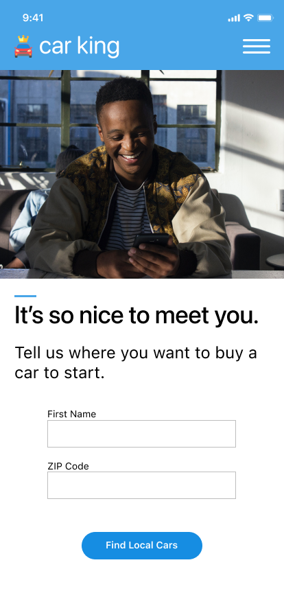
It was hard for me to imagine a business need that would require the system to collect the user’s name and zip code, but not other info like a phone number or email. In real life, I’d definitely need to work with the product manager on this feature to discuss the requirements.
I’d even argue that we don’t need the user’s first name at all, and can simply write an empty state message instructing the user to enter their zip code.
However, I also wrote a version that more strictly followed the scenario given with the second screen. This could make sense if we were trying to create a personalized onboarding experience for the user. If this were the case, I would probably recommend asking for name and zip code on different screens and upping the character limit so that I could provide more transparency as to why we need this info.
Day 11
Scenario: An elderly user is doing a Google search to find an easy way to buy contact lenses online.
Challenge: Write a title and meta description for a website that sells subscription contact lenses delivered to a user every 30 days—convince them to try it.
Title: 60 characters max
Meta Description: 160 characters max
I took a stab at this prompt, but it’s hard to know if this copy would be effective without any metrics or data to pull from. I used to work in content marketing, creating content that was heavily optimized for Google’s search engine. In my experience, you can write according to SEO best practices and get on the first page of Google’s results, but to get the first or second spot you have to be pulling from hard data.
For example, I worked on a content team where we let Google auto-populate our title and meta description. We did this because our users were especially savvy, and if if the meta description didn’t sound like it was pulled directly from the linked page, our users wouldn’t click it. They were highly aware of marketing copy and glazed over it like it was paid content.
Going back to the prompt, it explains that this content is for an elderly user. This means that I’d need to do some keyword research to find out what keywords elderly contact wearers are searching for, and make sure that I’m writing to their needs. This is a pretty niche audience, so although I did some preliminary research using Google Trends, I couldn’t find much. However, simply searching terms like “contact lenses for over 70” and “contacts for seniors” did provide me with many results, which at least gives me an inkling that a group of users is indeed looking for products like this.
Ideally, I’d be writing this title and meta description for a page that already exists. That way, I can see what keywords it already ranks for, if any, and create a plan of attack from there. Using a tool like Google Analytics, I could get answers to the following questions:
What keywords does the page perform well for?
What keywords are low-hanging fruit to target?
What other similar topics do the competitors who perform better than me write about?
But if this were a new page, I wouldn’t have access to this sort of data and would end up going with what I’ve written in the image above. Thankfully, SEO is a practice that lends itself well to iteration. Whatever doesn’t work can always be changed and submitted for re-indexing by Google.
Day 12
Scenario: A user is creating an account. When they come to the step where they are asked to enter their name, they get an error message. A fraud detection software thinks their name is fake—but it’s wrong 5% of the time.
Challenge: Write an error message that prompts them to fix the error without shaming them for having a fake-sounding name.
45 characters max
For this one, I created an in-line error when the fraud detection software thinks the user’s name is fake. But I also linked out to an additional resource the user could reach out to learn more about why they’re getting the error message and potentially get help if it’s their real name.
The resource could say something like:
Why we use real names on makefriends
It’s important for all users on our platform to feel confident that they’re making connections with real people. That’s why we’re extra careful about the names we let you use when signing up. Sometimes though, we can be a little too careful. If you’re having trouble signing up using your real name, email us at help@makefriends.com and we’ll assign someone to assist you right away.
Day 13
Scenario: A short-haul truck driver has a phone app that monitors his route, schedule, fuel & deliveries.
He has 6 more deliveries before stopping for fuel and lunch. Due to unexpected traffic, he’s behind schedule.
He can choose to stay on his planned route for a few more stops, but risk running low on fuel and missing lunch, or he can get fuel and lunch now and finish the deliveries later.
Challenge: Write a push notification alerting him of this dilemma and options.
Headline: 30 characters max
Body: 45 characters max
Button(s): 25 characters max
The ask for this one is fairly simple as is the rationale for my copy choices. I think the requirements, however, are worth discussing. My initial (and untested) assumption here was that truck drivers would pretty much always have the app that displays their route open. I wasn’t sure about the efficacy of a push notification.
But then I figured there would be edge cases when perhaps a driver accidentally puts his or her phone into sleep mode. In those cases, a push notification would be imperative.
However, I thought again and wondered if we should ever allow users to enter sleep mode while on an active route. This might be too much of an ask if drivers need their phones for other aspects of the job, such as calling recipients.
But maybe it would be an overall better experience for the driver to have a device permanently affixed to their truck, which would never fall asleep, and therefore never require push notifications. There are a lot of answered questions here, but I think anyone designing this message in real life should think about the entire experience of the user – not just what’s happening on the screen.
Day 14
Scenario: A user is shopping using a price comparison app that boasts “real-time” pricing on items. As they are checking the price of an item, something goes wrong. The problem is unknown.
Challenge: write a message that informs the user that they cannot access the app right now. You cannot specify "why" the app doesn't work, you also want them to continue using the app.
Headline: 30 characters max
Body: 120 characters max
Button(s): 15 characters max
For this prompt, I imagined a Chrome extension that could crawl the web for the best deals while the user was online shopping.
This message would be triggered by clicking the browser extension icon. Under normal circumstances, this would initiate a crawl that would then populate the overlay with the backpack at varying price points across the web.
Here, we see the error message that would show if anything went wrong when executing the crawl. I gave the user the option to try again or dismiss in case they changed their mind and didn’t want to move all the way over to the “X” button.
Day 15
Challenge: Write a multi-screen onboarding experience for a banking app that automatically pays a user's bills every month—as long as they set it up correctly.
Character constraints per screen:
Headline: 45 characters
Body: 100 characters
Button: 25 characters
For the best viewing experience, please take a look at my prototype in Figma.
This challenge was all about encouraging the user to complete the task at hand. First, I identified the benefits of this feature and made them clear on the first screen.
I used a conversational tone so that the flow could be as transparent as possible while reducing confusion. I also decided to surface when the first three payments would be scheduled so the user could preview their autopay settings.
I wanted to make sure there was an exit route for the user so they could stop at any time. So I added a “Cancel” button that opens up a confirmation modal.
Finally, I added a summary so the user could review all their info at once before submitting.